Twin Peaks
Services: Branding, Design
This concept work involved redesigning an album cover of a relatively unknown artist. Naturally I took this as an opportunity to go through one of my favorite band’s discography (Twin Peaks), ultimately deciding upon their first album, “Sunken”.
Problem:
How might we redesign the “Sunken” album to represent the band’s music?
Goal:
Design a vinyl album cover that is emblematic of the raw and electrifying aspects of Twin Peaks’s freshman album.
Ideation
Results:
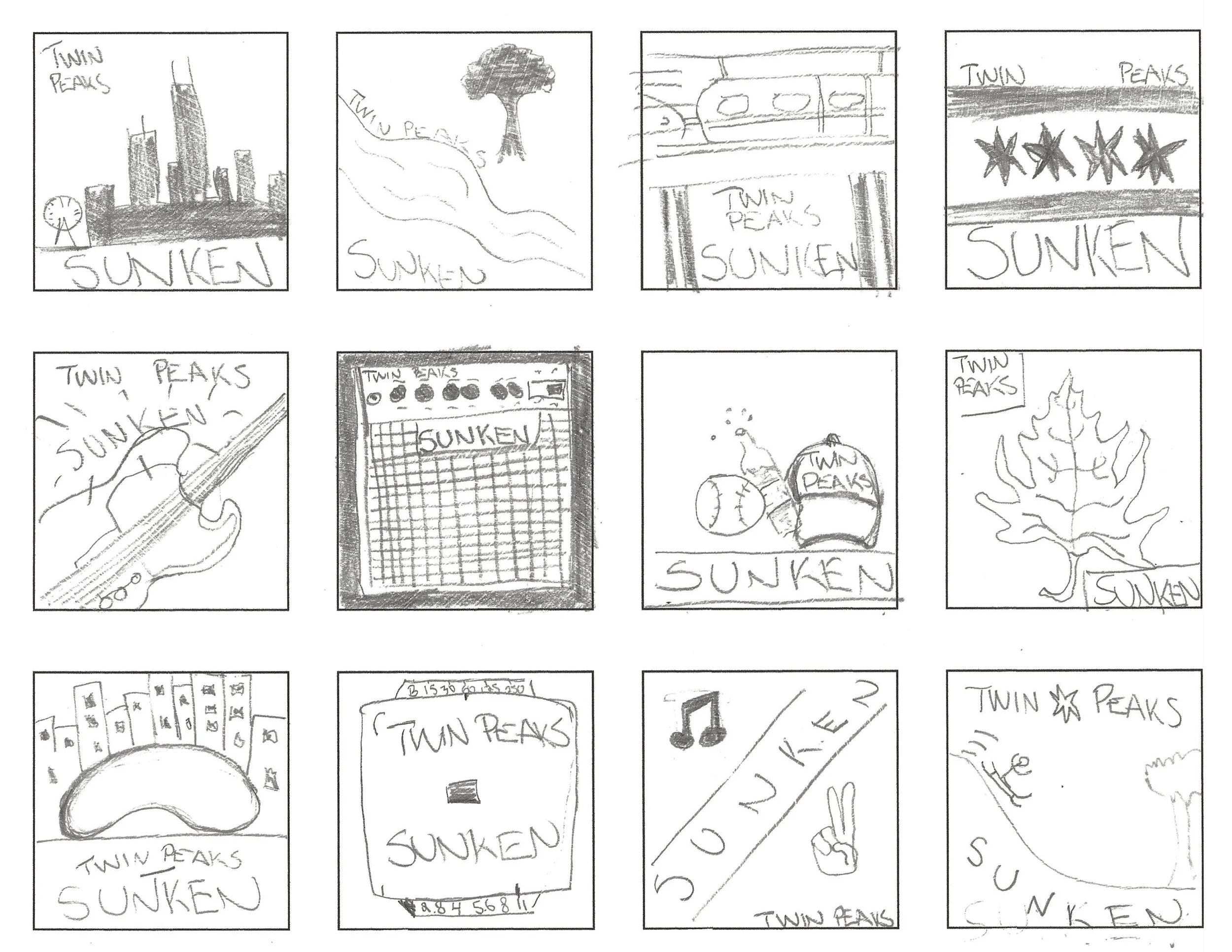
I started by sketching thumbnails of Chicago since the band hails from the Windy City. This included landmarks, symbols, and other visuals that came to mind.
I eventually explored visual elements one would encounter in an urban environment - a mixture of organic and inorganic textures conveying a feeling of rawness and transience.
I then blended these techniques with typographic layouts for the final album design.
Finished Design
Conclusion:
From the get-go, I assumed I would be using a photograph as the focal point of the design, however I couldn’t have been more wrong.
After many hours of experimentation, I ended up creating a piece that strips away any semblance of my initial idea: a typographic deconstruction using printer paper, acrylic paint, and minimal digital adjustments.
Ultimately, this ended up being an exercise in embracing fearlessness in my design process.


